Building a brand on warmth, trust, and authenticity

Ann Li
March 20, 2023 ⋅ 5 min read
Over the past couple of years, I watched from the sidelines as many of the small businesses in my community struggled and ultimately shut down during the devastating COVID pandemic. I joined Baton during the Summer of 2022 because I was drawn to Baton’s vision to make small business ownership more attainable, and the opportunity to design a brand that brings that vision to life. I was inspired by this team, whose daily goal is to empower small business owners and be their advocates to help them grow and succeed.
Our Approach
We set out to create a brand identity that resonates with the hardworking individuals we serve every day - a brand that communicates our mission and vision in every aspect of design, such as colors, typography, textures, illustrations, iconography, and visuals. An identity rooted in our belief that small business owners and the communities that depend on them deserve better, and that small business data should be free.
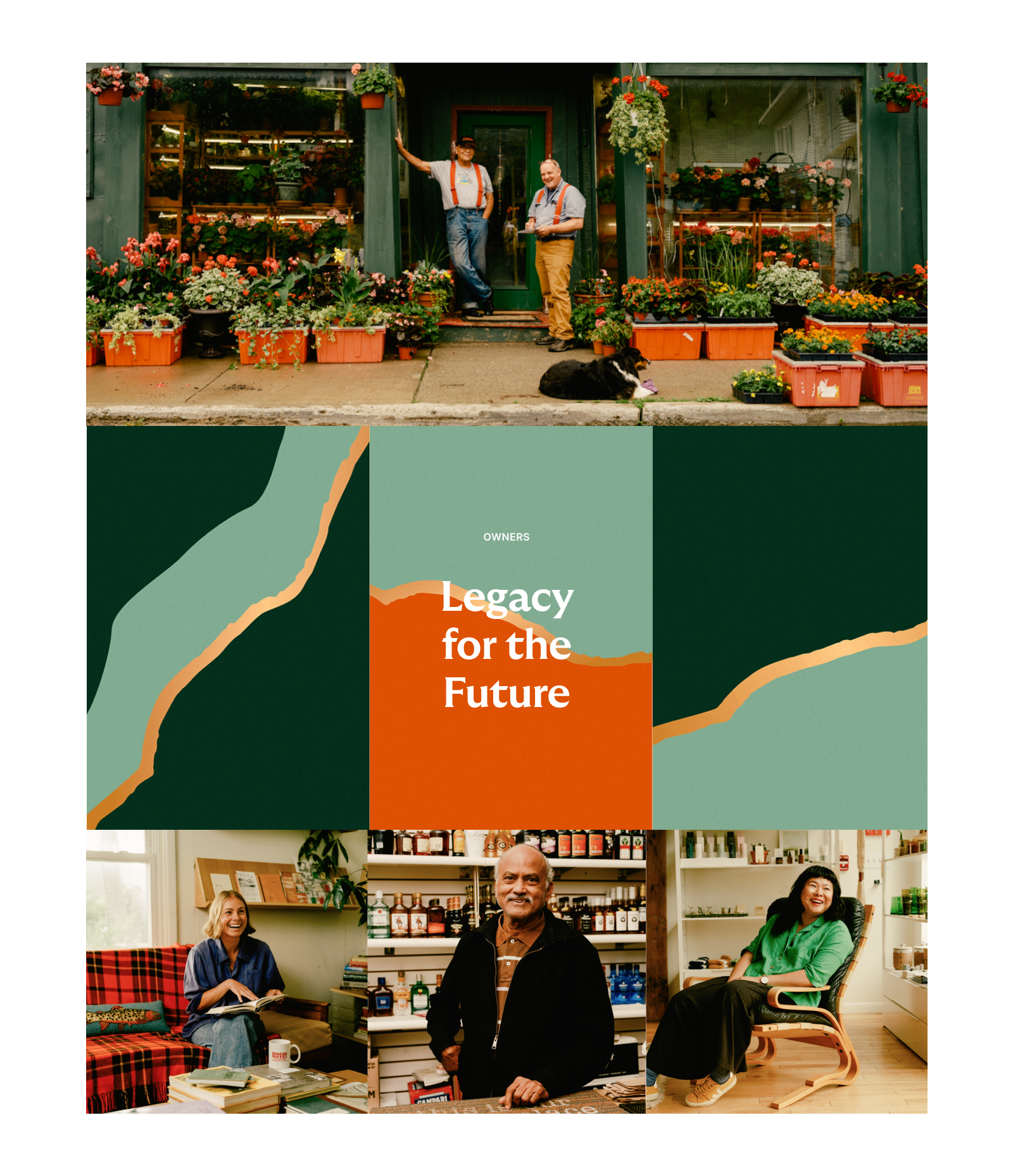
Baton had a strong early foundation on which to build something more robust and sophisticated. From the very beginning, we showcased real owners in their element through rich and authentic photography and storytelling. In this next evolution of the brand identity, we wanted to hold on to this aesthetic and tie it with a visual language that aligns with that authenticity.
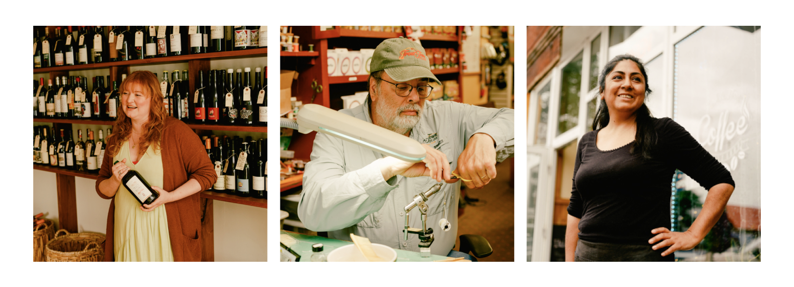
Real owners in upstate NY. Photography by Human NYC and Daniel Dorsa
What's in a Brand?
A brand is the foundation of user experience and is ingrained in every touchpoint across both physical and digital products, marketing, and sales. While we are relatively early on in the life of the company, it’s crucial to invest time and resources into our identity and how we use visual language to resonate with our users. And at Baton, we know our success or failure comes down to one thing - building trust with our community. That’s easier said than done - most of us have had negative experiences with online businesses at some point or another and we are right to be discerning about who to trust with our personal or professional data. We know that building trust takes time - and a strong, empathetic, and consistent brand that resonates with our users will only empower Baton’s intentions and capabilities in the market.
Like many industries waiting to be transformed by technology, the bar for user experience can be quite low, and this is a chance for us to differentiate from competitors with a distinct and elevated user experience.
Brand Principles
We used Baton’s mission and vision as the foundational framework - identifying the most powerful pieces and fleshing out keyword associations to bring our brand to life.
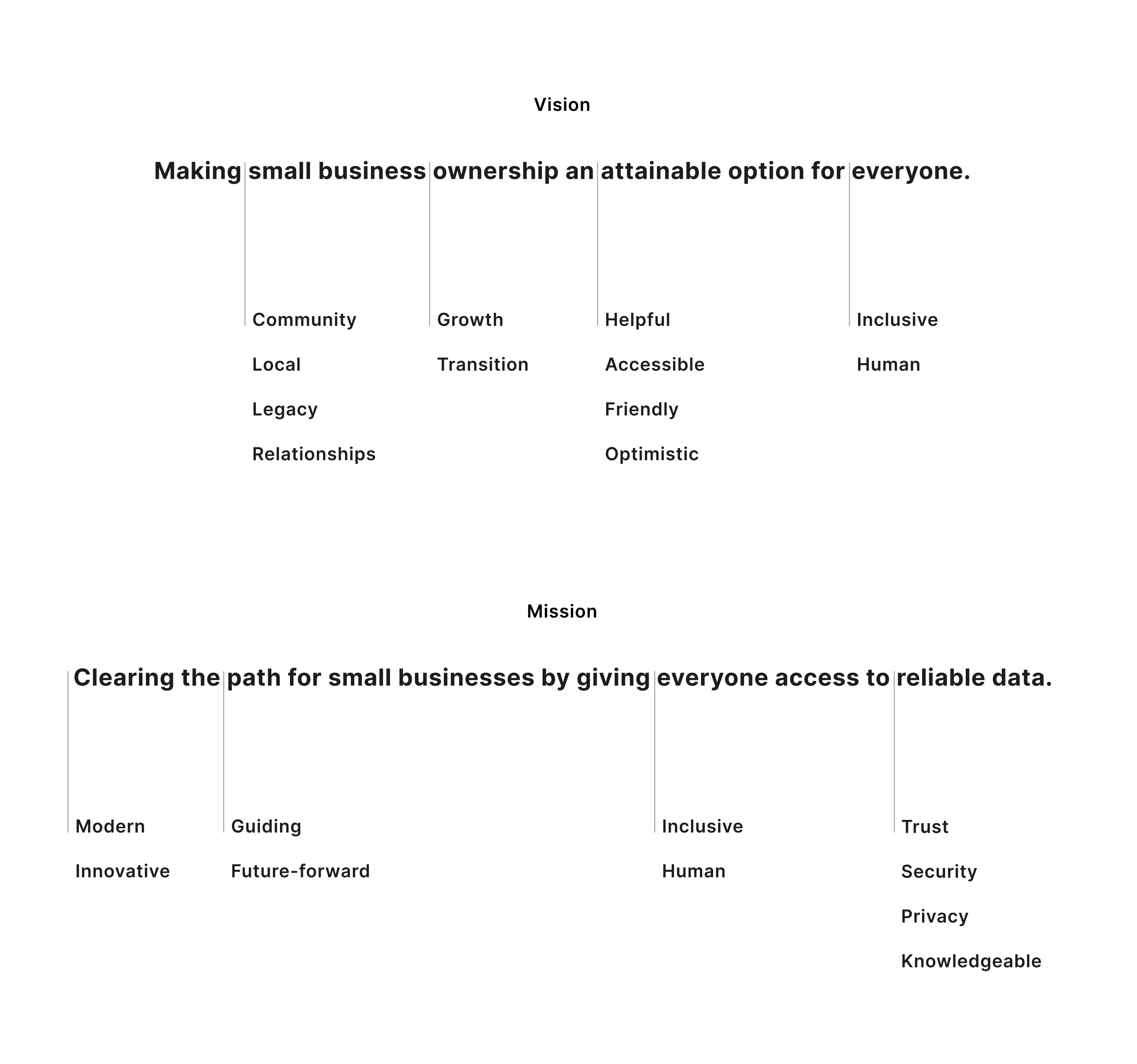
Looking into our vision and mission
We took this time to think about what we wanted Baton, as a brand, to evoke for our users:
Inclusive
Trustworthy
Knowledgeable
Optimistic
Warm
If our company was a real person, how would we describe our personality? Thinking about the brand this way helped us capture the complexity and intentions behind our company, without feeling like we needed to boil it down to just a flat list of keywords.
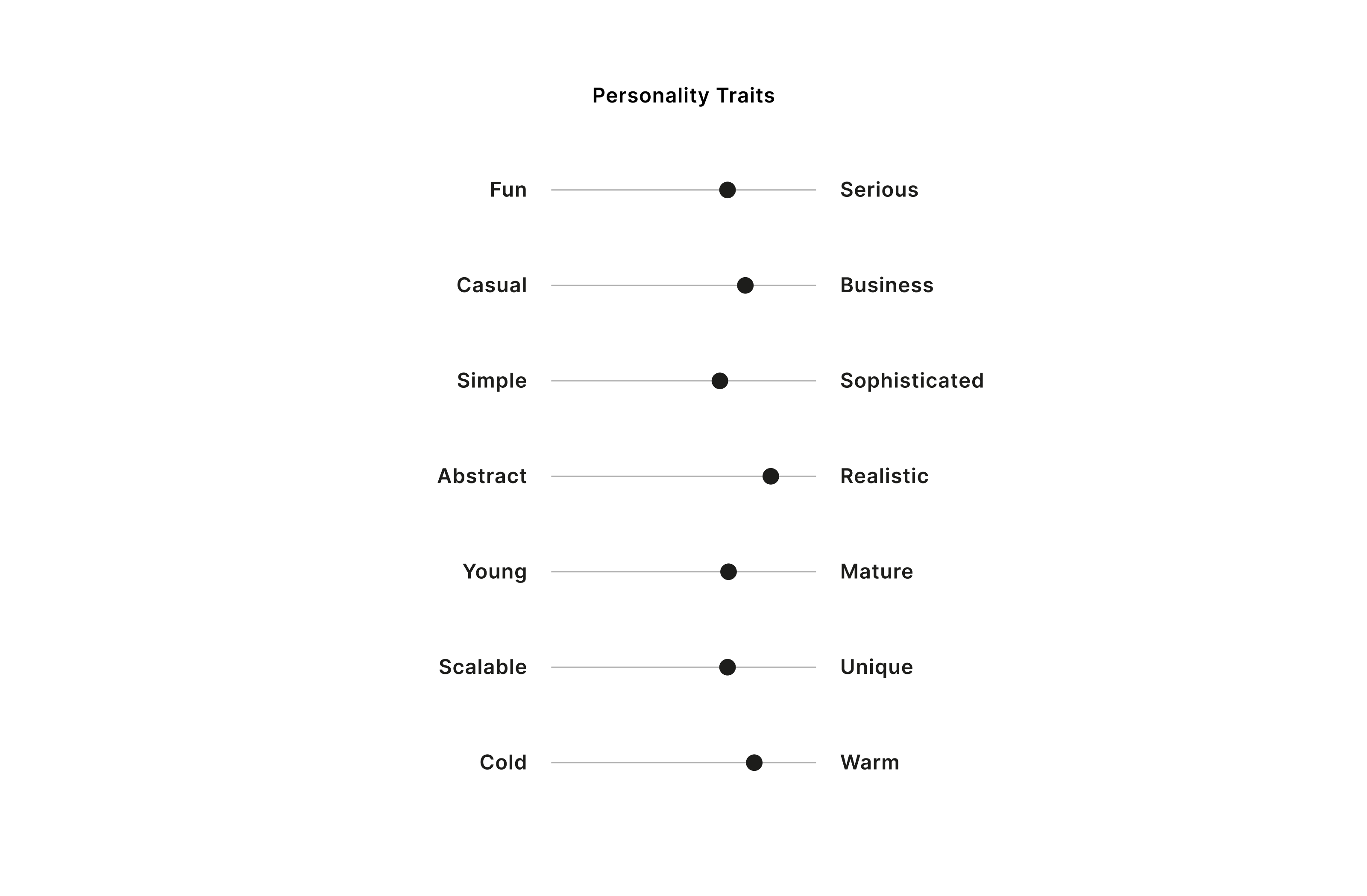
Where Baton sits in these ranges
Once we had aligned on the personality and vibe, it was time to create the visual foundation for the brand, and we started with color. As humans, colors send innate signals to our brains whether we’re conscious of it or not, and the colors we choose to tell our story will be perceived by our customers through their own lens of preconceptions and biases. Our early branding was blue. Blue is a familiar color that invokes trust, sincerity, freedom, and intuition. So many of the digital products we use are blue for this reason. For us, the blue palette felt a bit cold and blended in with the broad landscape of other digital products vying for our users’ attention. We wanted the brand to feel unique and distinguishable, with enough dynamism to speak to the mindset our users have throughout their journey.
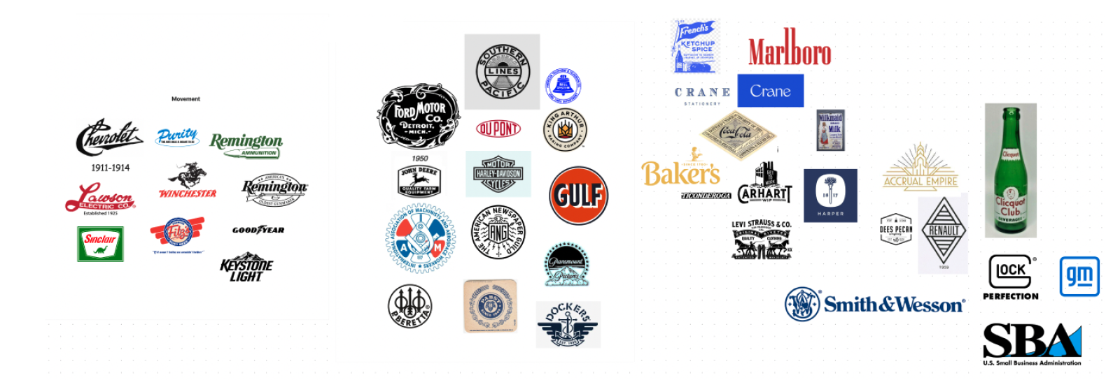
Ultimately we settled on warm tones of dark green and burnt orange. In color theory, green symbolizes new beginnings, growth, renewal, abundance, and calmness. Orange represents energy, enthusiasm, excitement, transition, and change. These are colors we’ve seen well utilized by blue-collar and heritage brands like John Deere, Harley Davidson, and Sinclair. A warm light cream, a humanistic and inviting tone, is used as the base color to ground green and orange.
Color and photography mood board. Inspiration credit: Forner Studio
This led us to logo wordmark exploration. We wanted to create a logo that gave homage to small business logos you might see on walking through Main Street in town, as well as hitting the brand personality and vibe. A bit of nostalgia that invokes vintage Americana. A logo you might see on the side of a truck on the highway. Something that felt comfortable and worn in, not pretentious. A balance of curves to edges, friendly but also sophisticated. Accessible but intelligent.
Logo inspiration mood board
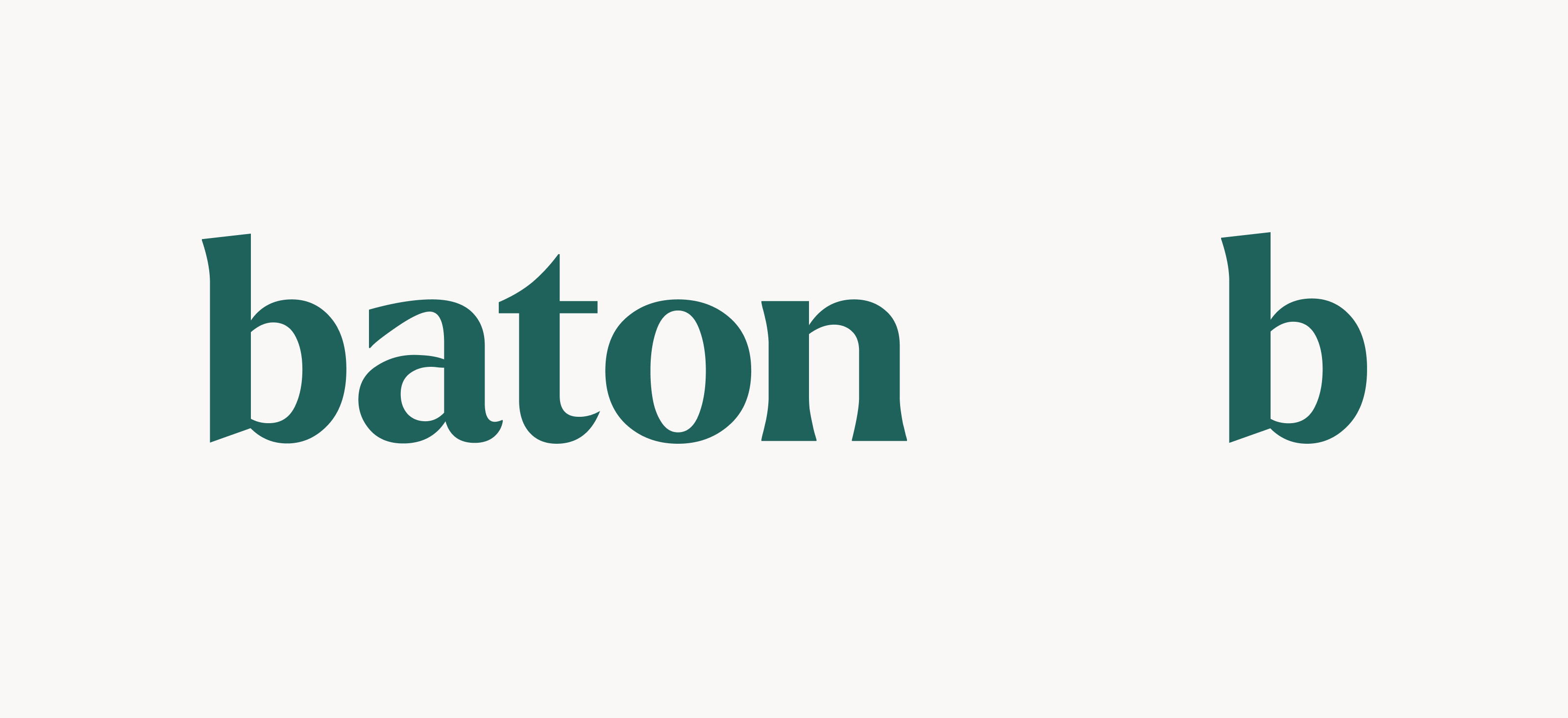
Our final logo in our core green
Paint textures and hand-drawn elements became an important part of our brand to invoke the hands-on nature of the businesses we support. Layering together our rich photography, textures, and parts of our product interfaces creates a dynamic and lively visual experience for our audience.
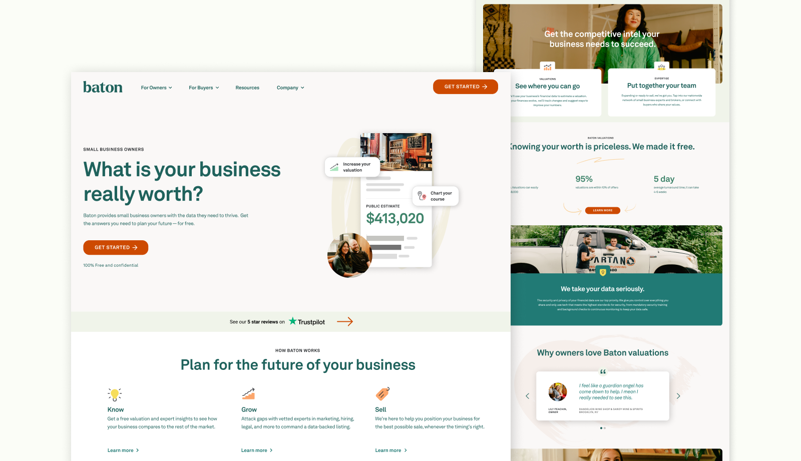
Our new homepage
The ultimate expression of our rebrand was our new marketing site and onboarding flow, which launched Thursday, February 16th, 2023. It’s an achievement of many months of different forces coming together - brand strategy, copy strategy, persona deep dives, and rounds of user testing. As we continue to iterate and improve our brand, instilling trust and transparency throughout all user experience touchpoints will always be top of mind. Lastly, we are so proud of all the work, collaboration, thinking, and passion that went into this rebrand. It took a small and mighty village - this could not have been done without co-founder Jamie Roth, Front-end Lead Jon Wagoner, UX writers Aubree Munar and Ben Elliott, and Head of Engineering Alex Roth. Thank you...best team ever...LFG!